TL;DR:
- A proper book layout depends on three key choices: trim size, margins, and a consistent grid. Proper setup ensures the reading experience feels seamless and professional for print publication.
A print-ready book layout rests on three controllable decisions: trim size and margins, typographic settings (measure, size, leading), and a consistent grid. Get those three working together and the design disappears behind the reading experience, which is exactly what good typography for books should achieve. Here is what to do in your first session.
Quick-start checklist:
- Choose your trim size before anything else (common Australian trade paperback: 152 x 229 mm)
- Set your inner gutter wider than the outer margin to protect text from the spine
- Pick a serif body typeface with appropriate size and leading to ensure readability.
- Build master pages and paragraph styles before placing a single word of body text
- Set a baseline grid that matches your body leading exactly
Table of Contents
- How to set up your document for print
- Typography essentials that make body text readable
- How a baseline grid keeps your whole book consistent
- Getting images and colour right for print
- Export and print: what Australian printers expect
- Which tool should you use for your book layout?
- Designing for readers with diverse needs
- Your pre-flight checklist before sending files to press
- How Tortugacreations approaches book layout
- Key takeaways
- A note on where to spend and where to save
- Tortugacreations can help you get this right
- FAQ
How to set up your document for print
Trim size drives every other decision. For Australian distribution, a standard trade paperback size suits most fiction and narrative nonfiction. Art books favour square or landscape formats because the source artwork often dictates the page ratio. Confirm your chosen size with your printer before building the file.
Spine width depends on page count and paper stock. Your printer will calculate it from those two variables, so ask them for the exact figure before you finalise the cover file.
Margins protect the text block and give the reader somewhere to hold the book. A practical starting point for a bound book: inner margin (gutter) 2.5–3 cm, outer margin 2–2.2 cm, top margin 2–2.5 cm, bottom margin 2.5–3 cm. The inner (gutter) margin must always be wider than the outer margin to compensate for spine curvature and prevent text loss into the binding.
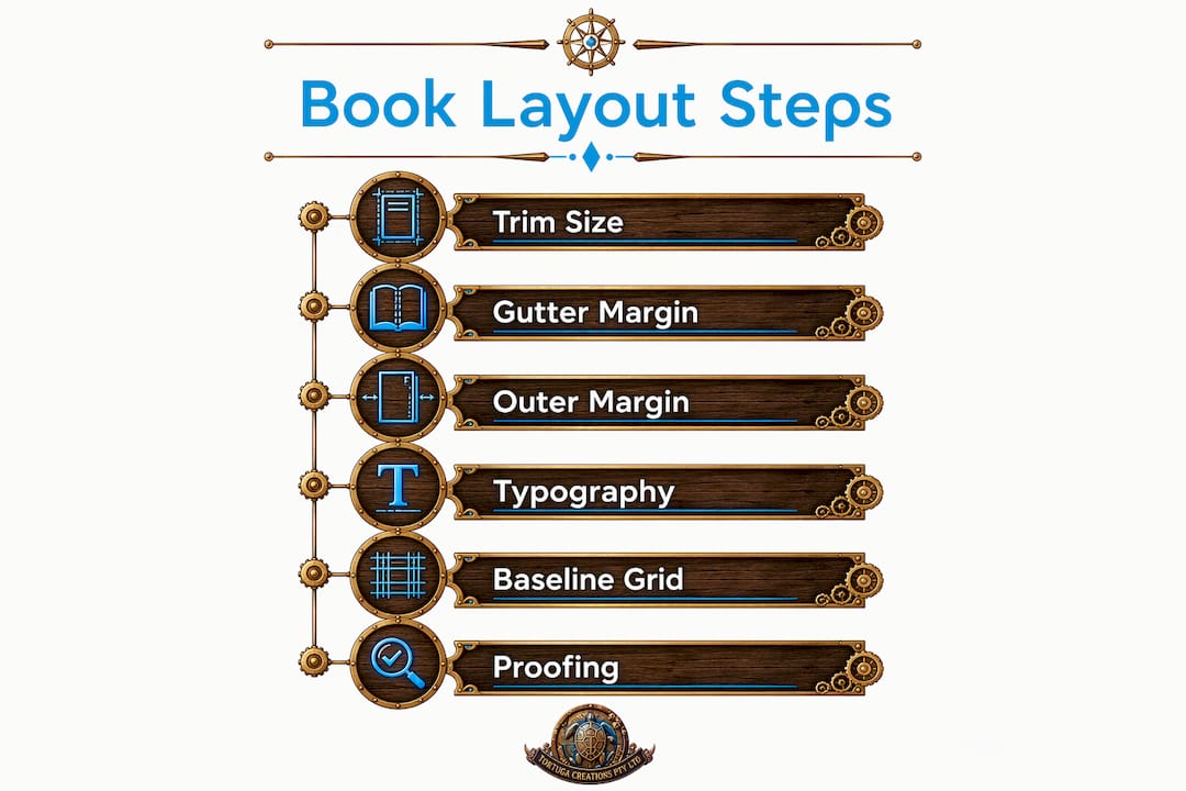
The inner margin must be wider than the outer to compensate for spine curvature. Neglecting this causes text to disappear into the binding. Add 3 mm of bleed on all outer edges for any image or colour that runs to the page edge.
Pro Tip: Print a single spread proof at actual size and fold it down the centre. If the text block feels cramped near the spine, increase the gutter by 3–5 mm before committing to the full layout.
Typography essentials that make body text readable
Body text for print sits comfortably at 9–11pt, adjusted for the typeface's x-height and your trim size. A typeface with a tall x-height (such as Minion Pro) can sit at the lower end; one with a smaller x-height (such as Garamond) often reads better at 10–11pt.
Measure, the number of characters per line, is the most overlooked setting in interior book design. The comfortable range is 45–75 characters per line, with 66 as a reliable target. To convert that to a column width: set a text frame, type a representative line of 66 characters in your chosen typeface and size, then measure the frame width. That measurement becomes your text block width.
- Set body size at 10pt as a starting point, then test on a printed page.
- Calculate measure by counting characters in a typical line, not by guessing column width.
- Set leading at 120–145% of the point size — so 10pt body text gets 12–14.5pt leading.
- Use first-line indents (roughly 1 em) for fiction; space-between-paragraphs for nonfiction.
- Tune hyphenation and justification settings to avoid rivers of white space in justified text.
- Catch widows (a single word on the last line of a paragraph) and orphans (a single line at the top of a page) before export.
Most professionally typeset books use justified text with tuned H&J settings; ragged right is a legitimate alternative but requires careful rag control so the right edge does not create distracting shapes.
Pro Tip: Prefer text-cut optical sizes over display cuts for body text. Garamond Premier Pro's "Caption" optical size, for example, is drawn with slightly heavier strokes specifically for small print, making it noticeably more legible at 9–10pt than the standard cut.
How a baseline grid keeps your whole book consistent
A baseline grid and consistent master pages keep facing pages aligned line-for-line and are the structural foundation of a visually calm book. Set the grid interval to match your body leading exactly. If your body text runs at 14pt leading, the baseline grid interval is 14pt.
- Create master pages (A-Master for standard text pages, B-Master for chapter openers) before placing content.
- Anchor all text frames to the baseline grid so body copy snaps automatically.
- Use paragraph styles for every text level: body, chapter title, subhead, caption, folio.
- For mixed text-and-image spreads, build a modular column grid (two or three columns) so image frames align to the same vertical rhythm as the text.
Consistency is the foundation of a professional publication; a grid acts as the invisible skeleton ensuring every page feels like part of a single object. That is not a design philosophy, it is a practical time-saver: global style changes take seconds when every element is style-driven.
Pro Tip: When checking facing pages, zoom to fit the full spread on screen and squint. Misaligned baselines across the gutter become immediately obvious at a glance.
Getting images and colour right for print
Resolution and colour mode are non-negotiable. Photographic images need 300 dpi at final print size, and all images must be in CMYK before export. Converting at the last minute inside your export dialogue is not a substitute for a properly converted and proofed file.
- Place images at 100% of their intended print size; scaling up in layout software reduces effective resolution.
- Convert RGB images to CMYK in Photoshop before placing them, using a press-standard profile such as ISO Coated v2 or the profile your Australian printer specifies.
- Extend any image that touches a page edge by 3 mm into the bleed zone.
- Embed all linked files or package the document before handoff; a missing link is one of the most common prepress errors.
- Use vector formats (EPS or PDF) for logos, line art, and diagrams — they scale without resolution loss.
- For art books, favour TIFF or PSD for photographic originals; PNG for graphics with transparency.
- Keep a "safe area" of at least 5 mm inside the trim line for any text or critical image detail.
- Proof a colour print on the actual paper stock your printer uses — screen previews cannot replicate ink-on-paper colour accurately.
Pro Tip: Use Photoshop's soft-proof function (View > Proof Setup > Custom) with your printer's ICC profile before converting. Colours that look vivid in RGB often go flat in CMYK; catching this before conversion lets you compensate with targeted adjustments.
Export and print: what Australian printers expect
PDF/X-1a is the safest choice for commercial print in Australia; PDF/X-4 is acceptable where your printer supports live transparency. Both standards require embedded fonts, CMYK colour, and crop marks with bleed included in the export.
- Export single pages, not spreads, unless your printer explicitly requests reader spreads.
- Include 3 mm bleed and crop marks in the export dialogue.
- Embed all fonts; never outline body text (it prevents last-minute corrections and inflates file size).
- Flatten transparencies only if your printer requests it; PDF/X-4 handles live transparency natively.
- Confirm the colour profile with your printer before export — Australian print houses often specify their own ICC profiles.
- For ebooks, export EPUB from InDesign or Affinity Publisher; MOBI is largely obsolete since Amazon's format shift.
- Always print a hard copy proof of at least one full spread before approving a print run. Screen previews cannot substitute for the feel of type on paper.
- Ask your Australian printer about lead times for proofs — most commercial printers require 5–10 business days for a physical proof.
Pro Tip: Export a low-resolution PDF first and read it on a tablet at arm's length. If the type feels small or the margins feel tight at that viewing distance, they will feel worse in the hand.
Which tool should you use for your book layout?
InDesign is the professional standard for complex, long-form books; Affinity Publisher is a cost-effective one-off-purchase alternative with comparable features for most book projects. Microsoft Word handles simple manuscripts but becomes unreliable once you add running heads, image anchoring, baseline grids, and complex indexing. Scribus is the free open-source option, capable but with a steeper learning curve and fewer prepress automation features.
- Adobe InDesign: best for multi-chapter books, complex indexing, and professional prepress workflows. Subscription-based.
- Affinity Publisher: strong alternative for authors and designers who want professional layout tools without a monthly fee. Handles master pages, baseline grids, and PDF/X export.
- Microsoft Word: viable for manuscript drafts and simple layouts; move to InDesign or Affinity Publisher once images, running heads, or an index are involved.
- Scribus: free and capable; good for budget-conscious self-publishers willing to invest time in the learning curve.
A layout spec sheet saves hours regardless of which tool you use. Document your trim size, margin values, paragraph styles, baseline grid interval, and image anchor rules in a single reference file before you start. If you are drafting your manuscript with AI assistance, a platform like novel writing with AI can help you reach a clean draft faster, ready to flow into your layout tool.
Pro Tip: The trigger to move from Word to a dedicated layout tool is the moment you place your first image or add a running head. Do it earlier rather than later — retrofitting a Word document into InDesign after 300 pages of content is placed costs far more time than starting in the right tool.
Designing for readers with diverse needs
Accessible typography is not a compromise on aesthetics. A minimum body size of 11pt, generous leading, and strong contrast between text and background make long-form reading comfortable for a much wider audience, including readers with low vision.
- Avoid full justification without carefully tuned hyphenation; uneven word spacing creates rivers that are particularly disruptive for readers with dyslexia.
- Use sans-serif typefaces for navigation elements (chapter titles, folios, running heads) where clarity at a glance matters more than reading rhythm.
- Maintain a contrast ratio of at least 4.5:1 between body text and background, in line with WCAG 2.1 Level AA guidance.
- Never use colour alone to convey meaning in diagrams or captions.
- Test your layout by printing a page and reading it under typical room lighting, not studio lighting.
- Check that captions and footnotes are at least 8pt, preferably 9pt, with proportionally increased leading.
- For ebook versions, use reflowable EPUB rather than fixed-layout where possible, so readers can adjust type size on their device.
- Avoid decorative typefaces for any text block longer than a pull quote.
Your pre-flight checklist before sending files to press
Run this checklist as your final pass before uploading or handing off files to your Australian printer.
- Trim size matches printer specifications exactly.
- Bleed is set to 3 mm on all outer edges; no bleed on the spine edge.
- All fonts are embedded; no missing or substituted fonts flagged in preflight.
- All images are 300 dpi at final print size and in CMYK.
- No RGB images remain in the document.
- Widows and orphans have been resolved throughout.
- Hyphenation is active and tuned (no more than three consecutive hyphenated lines).
- Front matter order is correct: half-title, title page, copyright, dedication, table of contents, foreword/preface.
- Back matter is complete: acknowledgments, bibliography or notes, index (if applicable).
- Folios (page numbers) are absent from the half-title and title page; Roman numerals used for front matter.
- Chapter openers start on a recto (right-hand) page for fiction; confirm with your editor for nonfiction.
- Running heads are suppressed on chapter opener pages and blank pages.
- Confirm proof type with your printer: digital proof, wet proof, or PDF soft-proof.
- Allow for Australian printer lead times when scheduling your publication date.
Tortugacreations' downloadable layout templates and spec sheets, available through the Life Resources Portal, give you a pre-built starting point for all of the above.
How Tortugacreations approaches book layout
At Tortugacreations, the studio process runs from research and concept through to layout spec, master pages, proofing, and print liaison. Philip Diaz's work across authored books — documenting cultural and sporting milestones with archive-quality precision — means every layout decision is tested against real print outcomes, not just screen previews.
The studio's assets available to you:
- Authored Books: finished examples of print-ready layout, from The Kings Blueprint to hardcover cricket heritage archives, showing what a fully resolved interior looks like.
- Original Artwork: archive-quality poster art demonstrating colour management and print-ready file preparation at its most demanding.
- Life Resources Portal: free informational resources including layout guides, spec sheets, and downloadable templates.
- Build it, Grow it, Earn from it module: a structured module for creatives turning their design skills into a sustainable business.
- Business Master Blueprint: proprietary workflow blueprints covering production, pricing, and client management for design studios.
- AI Cheats and Prompts: ready-to-use AI prompts for content creation, caption writing, and manuscript drafting that feed directly into your layout workflow.
Pro Tip: Download the Tortugacreations layout spec sheet from the Life Resources Portal and fill in your trim, margins, and paragraph styles before opening your layout software. Having those decisions documented in advance cuts your setup time significantly.
Key takeaways
A professional book layout comes down to three decisions made early: trim and margins, typographic measure and leading, and a baseline grid enforced through master pages and paragraph styles.
| Point | Details |
|---|---|
| Set the gutter first | Inner margin (25–30 mm / 2.5–3 cm) must exceed the outer margin (20–22 mm / 2–2.2 cm) to prevent text loss into the spine. |
| Target 66 characters per line | The comfortable measure range is 45–75 characters; 66 is a reliable target for body text. |
| Match leading to the baseline grid | Set leading at 120–145% of point size and match the baseline grid interval to that value exactly. |
| Run a printed spread proof | Screen previews cannot replicate how type and margins feel in the hand; print at least one spread before approving. |
| Use Tortugacreations resources | The Life Resources Portal, Build it, Grow it, Earn from it module, and downloadable spec sheets give you a print-tested starting point. |
A note on where to spend and where to save
When budgets are tight, the temptation is to cut corners on proofing or to stay in Word rather than investing time in a proper layout tool. From the studio's perspective, those are the two places not to save. A missed widow on page 47 or a gutter that swallows a sentence costs more to fix after printing than the time it takes to run a proper preflight.
Where you can save: paper stock on your proof copy (use your printer's standard stock for the proof, not the premium option), and time spent on decorative elements that readers will not notice. Where you should not save: the baseline grid, the gutter width, and a physical spread proof.
The Tortugacreations Life Resources Portal exists precisely for this situation, giving you free access to layout guides and spec sheets so the foundational decisions are already made correctly. For deeper help, the Business Master Blueprint and the Build it, Grow it, Earn from it module walk you through production, pricing, and client workflow in a structured, practical format.
Tortugacreations can help you get this right
Producing a book that looks as considered on the inside as it does on the cover is a craft, and it takes more than a template. Tortugacreations offers custom book layout, preflight and print liaison, archival poster art, and a growing library of authored books that demonstrate what a fully resolved, print-ready interior actually looks like in the hand.
The authored books collection gives you finished examples to reference, from hardcover cricket heritage archives to technical blueprint dossiers. The Master Business Blueprint and the Build it, Grow it, Earn from it module give you the business-side structure to turn your layout skills into a sustainable creative practice. Free downloadable spec sheets and layout templates are available through the Life Resources Portal at tortugacreations.com.au.
Ready to commission a layout or download a starter template? Head to the studio at tortugacreations.com.au and get in touch directly.
FAQ
What trim size should I use for a self-published book in Australia?
152 x 229 mm (6 x 9 inches) is the most common trade paperback trim size for Australian distribution. Art books often use square or landscape formats to suit the source artwork.
How wide should the inner margin be for a perfect-bound book?
The inner (gutter) margin should be 25–30 mm for a standard perfect-bound book. It must be wider than the outer margin to compensate for spine curvature and prevent text from disappearing into the binding.
What is the ideal line length for body text in a printed book?
A comfortable measure is 45–75 characters per line, with 66 characters often cited as a reliable target for extended reading in print.
Which software is best for book layout design?
Adobe InDesign is the professional standard for complex books; Affinity Publisher is a strong one-off-purchase alternative. Microsoft Word suits simple manuscripts, and Scribus is the free open-source option for budget-conscious self-publishers.
Do I need to convert images to CMYK before exporting to PDF?
Yes. Commercial printers expect CMYK images at 300 dpi. Convert images in Photoshop using your printer's ICC profile before placing them in your layout file, rather than relying on the export dialogue to handle conversion.
Recommended
- Explore the technical beauty of Art, Design and sport with Tortuga Creations. Premium blueprint posters and technical dossiers for cricket and sneaker collectors. Shipping Australia-wide.
- Explore the technical beauty of ART, design and sport with Tortuga Creations. Premium blueprint posters and technical dossiers for cricket and sneaker collectors. Shipping Australia-wide.
- Authored Books — Explore the technical beauty of ART, design and sport with Tortuga Creations. Premium blueprint posters and technical dossiers for cricket and sneaker collectors. Shipping Australia-wide.
- Explore the technical beauty of Art, Design and sport with Tortuga Creations. Premium blueprint posters and technical dossiers for cricket and sneaker collectors. Shipping Australia-wide.