
TL;DR:
- Design for CMYK when preparing print files, and avoid relying on automatic conversions to maintain colour accuracy.
- Always set your target ICC profile early, embed it during export, and verify with a physical proof on the actual stock before printing.
Design for CMYK when your final product is printed. Full stop. Keep a wide-gamut RGB working file only when you need multi-channel masters, and then convert deliberately, proof physically, and never leave colour decisions to the printer's automated pipeline. For collectors commissioning archival posters, history enthusiasts producing authored books, and creative entrepreneurs building a body of work that lasts, this distinction is far from academic. It is the difference between a print that honours your vision and one that quietly betrays it.

Three immediate actions before you send a single file to press: set your target ICC profile early (ISO Coated v2 / FOGRA39 is the standard starting point for coated stock), embed that profile on export, and request a hard proof on the actual stock before approving a run.
Tortuga Creations Pty Ltd follows this workflow on every archival poster and authored book we produce, and we recommend eciRGB_v2 as the working colour space when masters need to travel across multiple output channels before final CMYK conversion.
Table of Contents
- What is the real difference between CMYK and RGB for printing?
- How do you prepare a print-ready file step by step?
- Why do ICC profiles and proofing matter so much?
- What mistakes do designers make when converting RGB to CMYK?
- What do these choices mean for collectors and creative entrepreneurs?
- Key takeaways
- Why Tortugacreations insists on hard proofs and early colour management
- Tortugacreations can handle your prepress and archival print production
- Useful sources and standards
- FAQ
What is the real difference between CMYK and RGB for printing?
RGB is additive colour. Your monitor, phone screen, and TV all mix red, green, and blue light to produce every colour you see, and the gamut (the total range of reproducible colour) is wide. CMYK is subtractive. A press lays down cyan, magenta, yellow, and black inks on paper, and each layer absorbs light rather than emitting it. The gamut is narrower, and the results depend heavily on ink, stock, and press condition.
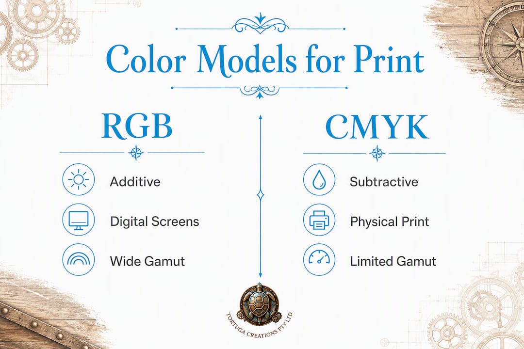
That gap between the two systems is where colour grief lives.
| Dimension | Web / screen assets (RGB) | Print masters (CMYK) |
|---|---|---|
| Use-case | Digital displays, social media, websites | Posters, books, archival prints |
| Colour gamut | Wide; includes neons, electric blues | Narrower; some RGB colours are unprintable |
| Proofing | Visual check on calibrated monitor | Soft proof + contract-grade hard proof |
| File / export | PNG, JPEG, sRGB embedded | PDF/X-4, TIFF, output ICC profile embedded |
| Visual shift risk | Low (screen to screen) | High for saturated hues; lower for neutrals |
| Archival implication | No physical permanence | Stock, ink, and ICC profile determine longevity |
Bright blues, neon greens, and intense oranges sit outside what most CMYK presses can reproduce. They will shift, sometimes dramatically. Skin tones, warm neutrals, and mid-range colours survive conversion far better. Coated and uncoated stocks change the result further: the same CMYK values look richer on coated paper and softer on uncoated, so the ICC profile must match the exact stock you are printing on.
How do you prepare a print-ready file step by step?
Follow this in order. Skipping steps is where reprints happen.
- Set document size, bleed, and resolution first. Work at 300 ppi for photographic content. Add 3 mm bleed on all sides. Confirm trim marks are on.
- Choose your working colour space. Use eciRGB_v2 for masters that will go to multiple outputs. If this is a single print run, set CMYK from the start using the printer's supplied profile.
- Obtain the printer's ICC profile. Ask for their exact output profile (commonly ISO Coated v2 / FOGRA39 for coated stock), their total area coverage (TAC) limit, and their preferred rich-black recipe.
- Convert linked images individually. Do not rely on a global document conversion. Convert each placed image to the target CMYK profile using the appropriate rendering intent.
- Set rendering intent. Use Perceptual rendering for photographs; use Relative Colorimetric for logos and flat graphics with brand colours.
- Run a soft proof. Simulate the printer's profile in Adobe Photoshop or Illustrator. Enable out-of-gamut warnings and adjust problem areas manually.
- Export to PDF/X-4. PDF/X workflows preserve embedded profiles and transparency handling. PDF/X-4 supports live transparency and modern colour workflows.
- Preflight the file. Check for RGB images still embedded, missing fonts, incorrect bleed, and unembedded profiles before sending.
- Request a hard proof. A digital soft proof is a guide, not a contract. For archival work, a physical proof on the actual stock is the only reliable sign-off.
Export spec summary:
- Resolution: high enough for print quality, suitable for photos and line art
- Bleed: appropriate margin around all sides
- File format: PDF/X-4 preferred; TIFF for standalone images
- Profiles: embed output ICC profile; do not leave untagged files
- Rich black for large fields: confirm recipe with printer and always verify total area coverage limits
- Small text: use black ink only to avoid registration blur
Why do ICC profiles and proofing matter so much?
An ICC profile is a standardised file that describes how a specific device (your monitor, a press, a proofer) reproduces colour. Think of it as a translator: it tells the next device in the chain what your colour intent actually is, so the press does not have to guess.
The International Color Consortium developed the ICC standard, and ISO/FOGRA built press-condition profiles on top of it. ISO Coated v2 (FOGRA39) is the most widely used profile for coated offset printing in Australia and Europe. It describes a specific ink set, paper type, and press condition, and matching your file to it means your CMYK values are interpreted the same way at the printer as they were on your screen.
Soft proofing simulates the printer's profile on your calibrated monitor. It is fast and free, and it catches obvious gamut problems before you spend money on a physical proof. Online soft-proofing tools can preview shifts and flag out-of-gamut colours early, though they explicitly state they are not certified proofs.
Hard proofing is the contract. A contract-grade hard proof on the actual stock and finish is the only way to confirm:
- Rich-black recipe depth and coverage
- Small-type registration (no colour fringing)
- Spot-colour accuracy if Pantone inks are specified
- How the stock's surface affects perceived saturation
For archival posters and authored books, soft-proof during design and then require a final hard proof before approving the run. That sequence preserves authorial intent and prevents costly reprints.
On rendering intents: Perceptual rendering compresses the entire gamut to fit the output space, preserving colour relationships across an image. Relative Colorimetric clips out-of-gamut colours to the nearest reproducible value and leaves in-gamut colours unchanged. Photographs generally benefit from Perceptual; flat graphics and brand colours from Relative Colorimetric.
What mistakes do designers make when converting RGB to CMYK?
- Designing in sRGB and trusting the printer's auto-conversion. Industry practitioners flag late-binding as a leading cause of colour mismatch. Set your target ICC profile at the start, or perform a manual, controlled conversion before sending files.
- Using 100% K for large black fields. A single-ink black looks flat and washed out on coated stock. Rich-black recipes give deeper coverage; small text must stay 100% K to avoid registration blur.
- Double-converting. Converting from RGB to one CMYK profile and then to another causes colour drift. Convert directly to the final output profile, or start with eciRGB_v2 and do a single controlled conversion.
- Ignoring muddy colours after conversion. Oversaturated RGB colours that fall outside CMYK gamut do not just shift; they can go flat or muddy. Soft-proof first, then adjust manually.
- Skipping the hard proof for archival runs. A soft proof on an uncalibrated monitor is worse than no proof at all.
Pro Tip: Set your target ICC profile on day one of a project, not the day before you send to print. Every colour decision you make during design will be informed by the actual output space, and you will spend far less time correcting at the end.
What do these choices mean for collectors and creative entrepreneurs?
For anyone commissioning or producing archival prints and authored books in Australia, colour mode is a purchasing and commissioning decision, not just a technical one.
When to insist on Pantone or spot inks: if a hero colour (a brand red, a heritage navy, a signature gold) must be exact across a print run, specify a Pantone value and budget for spot-ink printing. CMYK process cannot guarantee exact brand-colour reproduction across sheets.
When CMYK process is the right call: for photographic posters, illustrated books, and multi-colour archival prints, CMYK process on coated stock with a verified ICC profile delivers excellent results at a realistic cost.
For Australian buyers specifically: factor domestic proof turnaround into your release schedule. A hard proof from a local printer typically takes a few business days. Shipping time for international proofs can blow out a launch date. Local coated stocks vary, so always confirm the printer's available paper grades and request the matching ICC profile for the stock you are using.
Tasks to delegate to a studio vs. keep in-house:
- Delegate: ICC profile selection, prepress file checking, hard-proof coordination, rich-black recipe, PDF/X export
- Keep in-house: colour intent decisions, proof sign-off, final file packaging approval, brand colour specifications
For archival giclée and museum-quality prints, the stock and ink combination is as important as the ICC profile. A poster size guide can also help collectors factor viewing distance into colour and contrast decisions before commissioning.
Key takeaways
Prepare print files in CMYK with an embedded ICC profile, soft-proof during design, and always request a contract-grade hard proof on the actual stock before approving an archival run.
| Point | Details |
|---|---|
| CMYK for final print files | Always deliver press-ready files in CMYK with the printer's output ICC profile embedded. |
| Set ICC profile early | Choose ISO Coated v2 / FOGRA39 or the printer's supplied profile at the start of the project. |
| Soft-proof then hard-proof | Simulate the output profile on screen first, then require a physical proof on the actual stock for archival work. |
| Avoid auto-conversion | Manual, controlled RGB-to-CMYK conversion prevents unpredictable colour shifts on press. |
| Tortugacreations for archival work | Tortugacreations handles ICC profile selection, prepress, and hard-proof coordination for posters and authored books. |
Why Tortugacreations insists on hard proofs and early colour management
Every archival poster and authored book we produce at Tortugacreations goes through the same colour discipline: eciRGB_v2 as the working space for masters, a manual conversion to the printer's ICC profile, a soft proof with out-of-gamut warnings enabled, and a contract-grade hard proof before any run is approved. We do not leave that step to the printer's RIP, and we do not accept a screen preview as a substitute for ink on paper.
The reason is simple. A screen emits light. Paper reflects it. No monitor, however well calibrated, perfectly simulates how ink sits on a coated or uncoated surface. For a collector who has invested in a limited-edition print, or an author who has spent years researching a cultural history, that gap between screen and press is where legacy gets lost.
Our studio resources, including the Business Master Blueprint, AI cheats and prompts, and the Life Resources Portal, are built on the same philosophy: give people the tools and the knowledge to do things properly the first time. Colour management is one of those tools. So is knowing when to ask for help.
Tortugacreations can handle your prepress and archival print production

Tortugacreations produces archive-quality posters and authored books with full prepress support, including ICC profile matching, soft-proofing, hard-proof coordination, and PDF/X export. Whether you are a collector commissioning a limited-edition print, an author preparing a cultural history for press, or a creative entrepreneur building a product line, we manage the colour workflow from working file to finished piece.
Send us your working files, your colour intent, any brand CMYK or Pantone values, your preferred stock, and your delivery dates. We will handle the rest. The Build It Grow It Earn module and our AI prompts library are also available for entrepreneurs who want to build the business side of their creative practice alongside the production work.
Request a prepress review or browse the full catalogue at tortugacreations.com.au.
Useful sources and standards
Key references for colour standards, profiles, and proofing tools:
| Standard / Resource | What it covers | Source |
|---|---|---|
| eciRGB_v2 | Wide-gamut RGB working space for pre-conversion masters | ECI working colour spaces |
| ISO Coated v2 (FOGRA39) | CMYK output profile for coated offset printing | PDF Press colour management guide |
| PDF/X-4 | Export standard preserving profiles and transparency | PDF Press colour management guide |
| RGB-to-CMYK soft-proof tool | Browser-based preview for gamut shift checking | CheapRUSH Printing soft-proof tool |
- ECI (European Color Initiative): publishes eciRGB_v2 and eciCMYK exchange profiles; the primary authority on working colour spaces for print production.
- PDF Press colour management guide: covers ICC profiles, rendering intents, soft-proofing workflow, and PDF/X export in practical detail.
- CheapRUSH Printing CMYK guide: practical notes on rich-black recipes, stock differences, and common conversion mistakes.
- ISO 16760:2014: the ISO standard governing RGB workflows for graphic arts printing, including requirements for ICC profile pairs on print-targeted RGB images.
FAQ
What colour mode should I use for printing?
Use CMYK for any file going to a commercial press. Set the target ICC profile (such as ISO Coated v2 / FOGRA39 for coated stock) at the start of your project, not at export.
When should I convert RGB to CMYK for print?
Convert as early as possible in the workflow, using the printer's supplied ICC profile. Late conversion by the printer's RIP risks unpredictable colour shifts, particularly for saturated or brand-critical colours.
What is eciRGB_v2 and do I need it?
eciRGB_v2 is a wide-gamut RGB working colour space recommended by the European Color Initiative for agencies and publishers who need to repurpose assets across multiple print outputs before committing to a single CMYK profile.
Is a soft proof enough, or do I need a hard proof?
A soft proof catches obvious gamut problems early, but it cannot replace a physical proof for archival work. Always request a contract-grade hard proof on the actual stock before approving a print run.
Does Tortugacreations handle colour management for commissioned prints?
Yes. Tortugacreations manages ICC profile selection, prepress checking, soft-proofing, and hard-proof coordination for archival posters and authored books produced through the studio.